Thursday, May 6, 2010
Conclusion
I think that my animation would be suitable for children, because even though it is not on a subject that is generally taught to today's youth, old age and death, the animation and the characters all both quite light hearted in their appearance, and would only want to facilitate the story, rather than actually scaring them about death and dying.
If I had the chance to add to, or do this project again, I would definitely want to spend some more time perfecting other animation techniques, such as motion flow and attaching items to the bipeds hands. I also think I would have liked to have perfected the skinning of the models, so that they looked natural in all possible movements and positions.
My final words are that I have enjoyed making this animation very much, and look forward to improving and eventually perfecting this techniques so that I may produce bigger and better works in the times to come.
Incomplete / Unperfected Work
I am aware that the skin modifiers on both of the models are weighted in such a way that mean some kinds of movement lead to unnatural shapes and bumps. These can be seen in places such as when the old man is sitting on the log, the tops of his legs are sticking up in an odd way and when Death is holding his scythe above his head, his arm folds in on itself on the shoulder. I could have fixed these problems if I had more time but found myself against the clock when rendering times were mounting up into the tens of hours. I have made an effort to attempt to hide these problems with well placed lightning and cameras, but it can still be seen when looking out for them in certain places.
In my scene where the old man sits on the tree stump, I forgot to make the biped un-renderable, meaning that the bipeds wrists can be seen through the shirt of the old man. This problem could have easily been sorted out if it was again not down to time constraints as that particular scene took 20+ hours to render with the render options I was using.
What I Found Difficult
I also had problems with morphing the characters faces to allow for movement of the mouth and eyes. In the end I suffered with morphing so much that I did not include it at all, I decided that I could achieve a better level of work if I just had the characters head moving in such a way that would look if they were talking in a very cartoony way.As I was going for a very cartoony story, I feel it may have helped towards the theme.
The organisation of my files was also something that I struggled with in this project. Because of using many computers to produce the work, my files were scattered around everywhere, meaning that collating them to be put onto a disc was very difficult to do. I have endeavoured to put all of the files onto the disc so that they can be viewed, but am fearful that I may have missed one or two smaller files which may have been used in the scenes.
Other problems I encountered were seemingly not faults of my own, but faults of the 3Ds Max application itself. Whenever I attempted to load biped animation for the old man, the program would proceed to crash, making it impossible for me to load the information I needed, also, when I attempted to save my scene after I added rendering information to it such as the type of compiler to use, it would refuse to reopen at a later date, making it completely redundant.
My Achievements
The things I am most proud of in this project are being able to see that a model I have designed for the animation would not have been appropriate or would have fit the general theme, and being able to redesign and improve already existing designs to fix the initial concerns that I had.
This was done for example with the old man character, who in my original design was a rather tall and slender man, but did not have a cartoony enough design for him to fit in with the scene or the death character. I was able to find some reference online to how I thought the old man should have looked, and was able to quickly redesign him to fit my own personal style.
This also happened with deaths Scythe. Originally it was just a long, perfectly straight brown pole with the metal head at the top. I decided that this did not look right and went about designing a new scythe as though it had been a part of a trees limb at one point in its life. I was much happier that the scythe now looked more dynamic and organic.
Another thing I was happy with was my use of light in my scenes. I had one large Omni-light that lit the whole stage, and I tweaked its settings to make it seem as if it was bathing the whole forest in moonlight, I then came to a problem where the light not cover the old man's face when he was sitting on the rock, as it was facing away from the lights. I combated this with two other, very low power Omni-lights, which lit his face just enough to show his facial features.
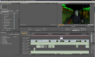
I am also very happy with now I managed to edit my rendered files together using Adobe Premier Pro. Some of my scenes were admittedly a little ropey around the edges, and I was able to clean them up substantially using some clever editing techniques.
I also used Adobe After Effects to add an anomaly effect onto the screen just before death appears, to give the impression of his impending arrival. I feel very good about using this software, as I had not used it ever before and feel that I went up and beyond what was asked of us on the brief to add an extra level of visualisation to my finished product.
Sound Effects
Most of the sound effects I used in my animation were either available via YouTube, or Free Sound Effect website which I found on Google. There are also a few sound effects that I have taken from Computer Games that I have installed on my computer, such as Team Fortress 2, and Half Life 2.
Because all of the sounds I found were either created and prepped for production or full songs, I did not have to use any sound editing software to cut them down and edit them.
Here is a list of sound effects that appear in my animation, and a link to where they were found online, if applicable:
(In Order Of Appearance)
Tubular Bells (Exorcist Theme) - Youtube : http://www.youtube.com/watch?v=bYmIKcP7Nbc
Ambient Night Sounds - Youtube: http://www.youtube.com/watch?v=e8ftZG_hlpU
Footsteps on Concrete - Counter Strike: Source
Rock Scraping Over Concrete - Half Life 2
Jeer - Team Fortress 2
Footsteps on Dirt - Counter Strike: Source
Battle Cry - Team Fortress 2
Sigh - PacDV : http://www.pacdv.com/sounds/voices-4.html
Small Explosion - Youtube: http://www.youtube.com/watch?v=qfGW4FuPGxo
Manic Laughter - Youtube: http://www.youtube.com/watch?v=ad8w8q3z7co
These are all of the sound effects that I used throughout my animation, Some of them, such as the footsteps and the sighing, have been used several times, I feel that the sounds I have used have brought my animation to life, and have added an edge to the animation that will not scare the children of our target audience, but entice and amuse them.
Editing
I studied Cinematography at College for two years and am already very comfortable using video editing software. Although at College I was used to using Final Cut Pro, Adobe Premier Pro is very similar, it only has a few subtle differences, so I feel that I have been able to use the editing software to the best of its ability in adding extra mood and feeling to the video, as well as editing out any small blips that may have made it through the rendering process.
I also used the editing suite to add some stylized titles to the beginning and end of my animation. At the beginning I added the title of the fable and at the end of moral of the story. I feel that by adding these two things to the animation, people who were not familiar or had not seen the fable before could become easily accustom to it and know what it was about with greater ease.
I am very pleased with how the editing part of this module has gone, and feel very confident about the final quality of my animation. The only thing that I noticed about my final rendered animation is that it seems very fuzzy compared to the first, raw render from 3ds Max, although I am sure this is just a compression issue, and does not compromise the integrity of the animation.
Scene 9 – Death Carries Rock
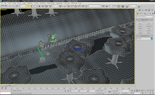
In this, the closing scene of my animation, we can see Death carrying the rock for the old man, whilst he walks behind. I made death hold the rock in such a way that would seem very comical to the watcher of the video, as he is holding it up in front of his face, completely obscuring his view of the road ahead. Even though he is holding the rock in this way, he isn't shown to be under any pressure, as I'm sure a super natural sentient being wouldn't have much trouble holding up a rock...
The camera in this scene is like the one in the opening scene also, but this time it also moves along the road with the characters, rather than being anchored on the edge of the road and simply panning to look at them. I felt I needed to have the camera like this opposed to how it was in the original show so that you could see the comical awkwardness of the scene. Neither of the two characters are making an attempt to converse with each other, and death can barely see where he is going over the top of the rock.
To animate this scene, firstly I used the footstep mode tool to make the old man walk at a steady pace. Like previously mentioned, because I do not use the legs of the biped from deaths model, I was unable to make him walk, instead, I moved his bip along the road at roughly the same speed of the old man's walk. I then added some height in between each of the key frames to give the effect that he was "bobbing" up and down along the path, to give him a more natural floating look. As for the camera, I key framed that along the path also at the same speed of the old man and death, making sure that they were in the centre of the shot all of the time.
Scene 8 – Death Face Palm
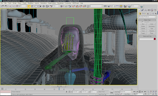
In this scene, death, who is disgusted with how the old man has had a "sudden change of heart" and shows his disbelief by burying his head in his hands and shaking it. Much like when death originally gives the old man his death threat, this is a well known symbolism of being annoyed. In this scene, death sighs whilst he is shaking his head, this is to emphasise again that he is not happy with what has happened. This was a very shot scene and just comprised of death shaking his head a few times before I faded it to black.
The camera in this scene was static, and did not move from its point at any time as the only animation was on the hands and face. I feel having the camera in this way showed all the information it needed to in an easy and effective.
To animate this scene, again all I have to do was to key frame the wrists and head using the auto frame tool. I also did some work on the fingers so that they would spread back to their normal position opposed to being curved around the wood of the scythe where he was gripping it.Scene 7 – Old Man Stops Death
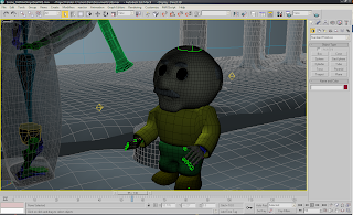
In this scene the old man jumps down off of his tree stump just before he's about to have his head removed by deaths scythe to shout at him that he only wanted death to move the rock for him. This is the first of two rather short scenes in which they only last for a few seconds each, so they need to portray their story elements very well and precisely. again using hand signals, I have the old man wave death off, and then pointed quickly at the rock on the path way. Instead of using speech I continued to use disgruntled mumblings to portray what the old man is saying to death.
The camera in this scene is static. The main reason for this being because of how short the scene is and that all of the main animation aspects of the scene are taking place right in the camera view anyway. It would have moved far too fast and jerkily if I had attempted to use a pan or moved the camera at all.
The way I animated this scene was to move the old man's hands from side to side at about shoulder height to show that he was waving his arms to stop death, this was done key framing using the auto key tool, which I have been using primarily through out all of my animation.
Scene 6 – Death Threatens Old Man
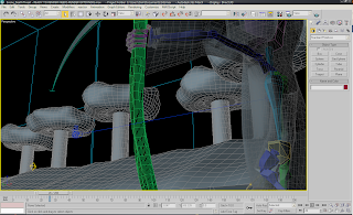
In this scene, death portrays to the old man that because he has prayed for death, his time is up. Once he has stated this fact, he raises his scythe and charges the old man, planning on ending his life. Again in this scene, I decided to portray death giving his message without him actually speaking. I achieved this by having him do the hand sign where you draw your finger across your throat. This is universally known as a death threat and I thought that it worked well with the characters. For sound effects in this scene, I struggled to come up with some that I thought were a good accompaniment. In the end I just decided that death should "explode" onto the screen straight from hell, and seeing as I did not have an animated explosion, I decided that I could use an explosion sound effect hand have the whole screen flash to white.
The camera in this scene pans around death whilst he is doing his sign language. When death raises his scythe and charges at the old man, the camera races ahead in front of death in anticipation of his movement.
To animate death pointing, I really only had to move his wrists and the scythe. To do this I used the auto key tool to set the key frames. For the movement of death, because I do not use the biped’s legs because he is a floating entity, I simply selected the bip from deaths biped, and dragged it to where I wanted him to move to.